W. W. Norton & Company, E-commerce Update
Overview
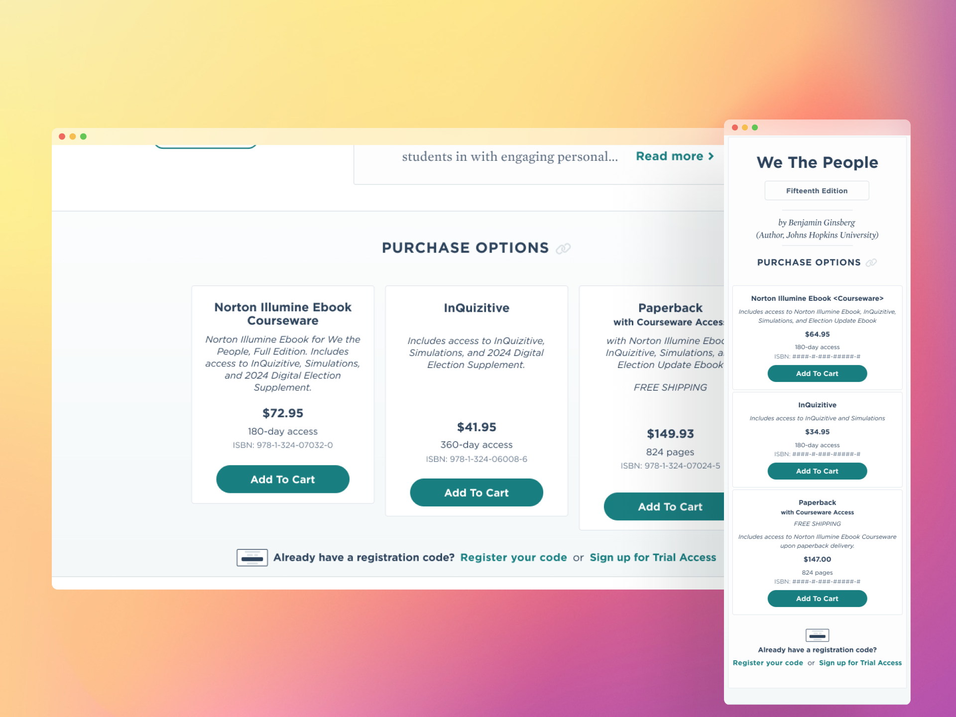
W. W. Norton & Company's e-commerce storefront separated digital and physical product purchasing across two different websites, requiring users to navigate between systems to complete a transaction.
This migration unified the entire purchasing experience into Norton's primary website, addressing fragmentation, friction, and content gaps that had long limited how students and instructors discovered and purchased Norton's digital products.
My Role
Lead Designer
Interaction Designer
Prototype
Content Design
Platform
Responsive & Accessible Web
Year
2025 - 2026
Problem
As part of our 0–1 initiative, we conducted exploratory research to better understand the role of assigned readings in college and high school courses and the specific challenges instructors face. This included a 3-day design sprint workshop with W. W. Norton's digital product leadership team.
1. Fragmented Purchasing Flow
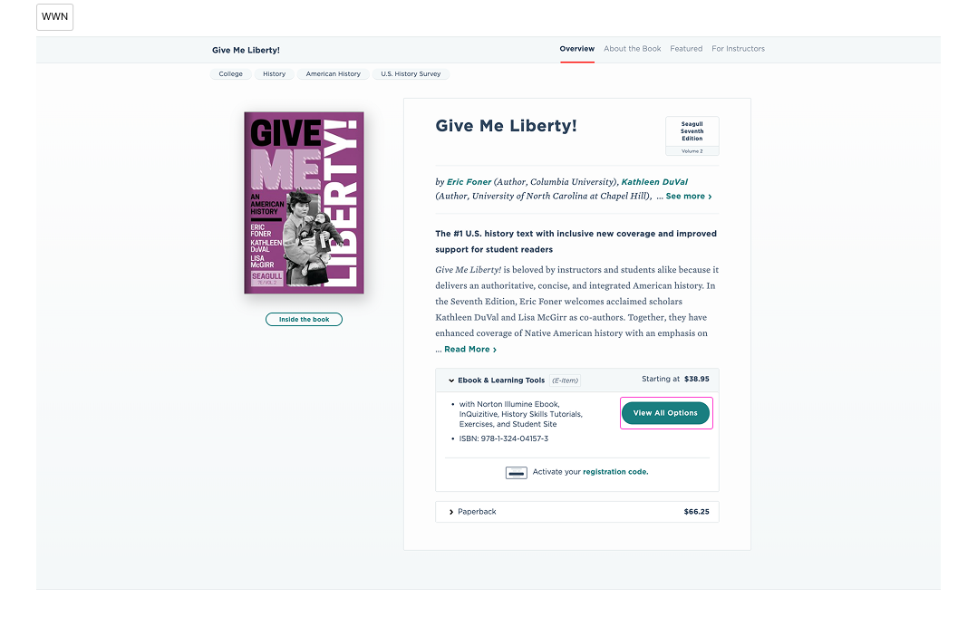
Purchasing a Norton digital product required 6 extra steps. Users browsed products on the main Norton website but had to navigate to a separate legacy system to complete the purchase, re-selecting options, re-entering their information, and re-entering payment details from scratch.
2. Missing Purchase Options
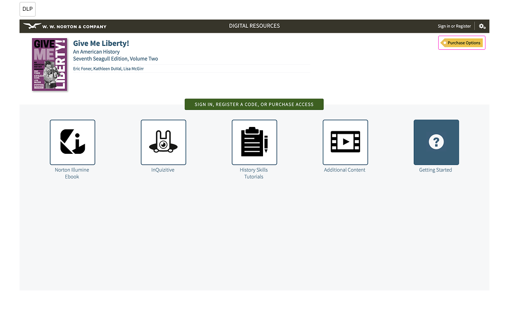
Individual digital products like InQuizitive were purchasable on the legacy system but invisible on the main Norton website, limiting what instructors could assign and students could purchase.
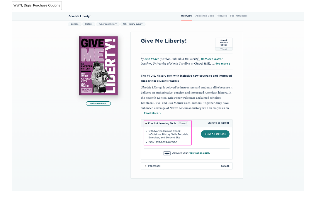
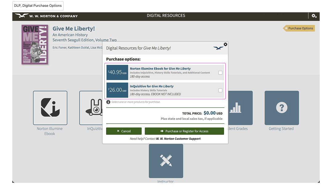
3. Inconsistent and Incomplete Content
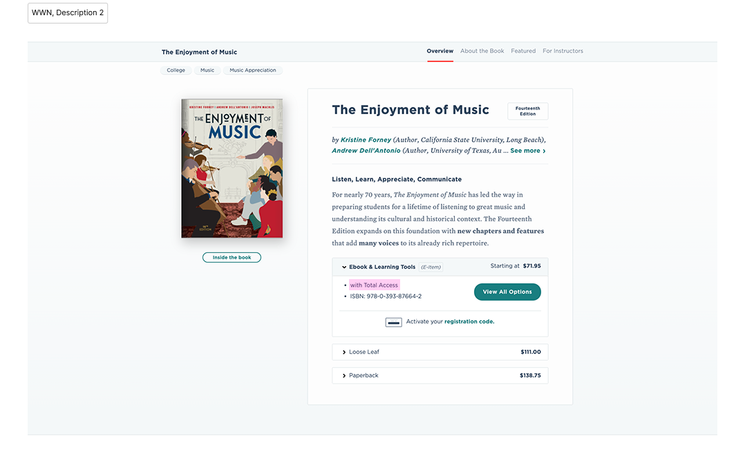
Product metadata was mismatched between the two websites, missing purchase details, inconsistent descriptions, and purchase customization options that existed on the legacy system but were never communicated on the main site.
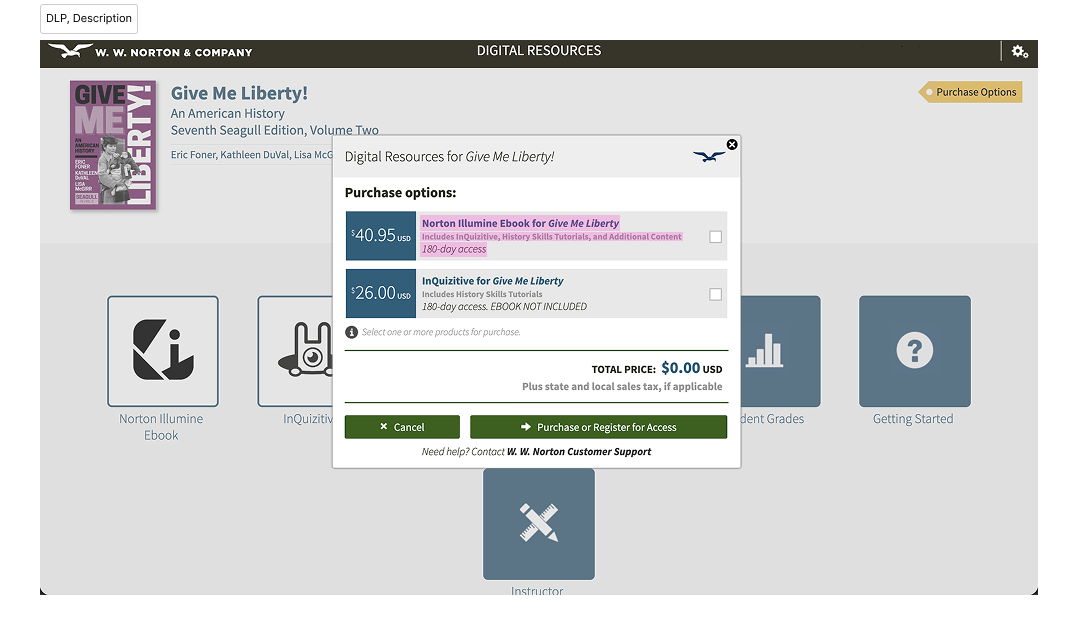
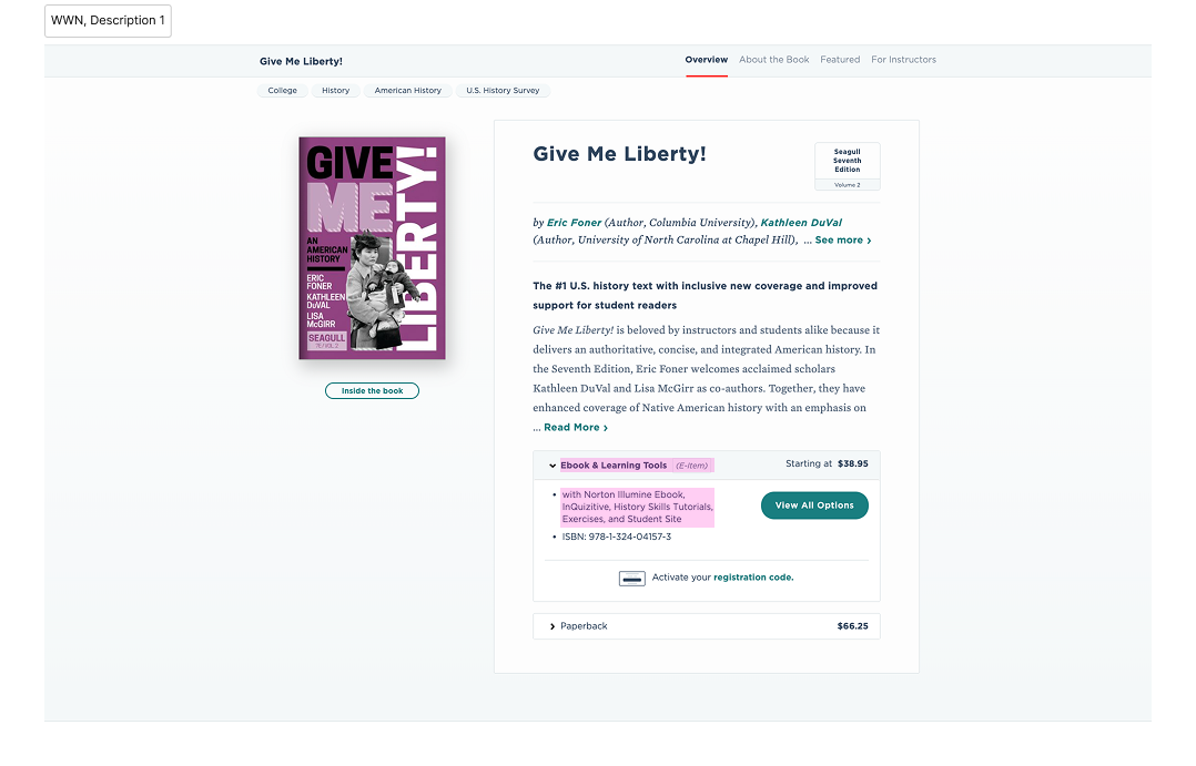
Opportunity
How might we unify Norton's digital and physical product purchasing into a single, seamless experience that gives students and instructors everything they need to discover and purchase Norton products in one place?
Goals
We converted the identified problems into opportunities for the e-commerce migration to address.
1. Fragmented Purchasing Flow → Unified Commerce Experience
Surface digital and physical product purchasing on the primary website and eliminate the need for users to navigate between two separate systems to complete a transaction.
2. Missing Purchase Options → Complete Product Visibility
Surface all available digital purchase options on the main Norton website, so there is no dependency on the existing legacy system.
2. Inconsistent and Incomplete Content → Set Content Standards
Ensure users see accurate, consistent, and complete product information at every step of the purchasing experience.
Existing User Flow
To understand the full scope of the fragmented user experience, I mapped the existing purchasing journey across four entry points.
Flow 01, Existing Physical purchase
Physical and digital purchases followed entirely separate paths, with digital access branching further into direct purchase, registration code redemption, and trial access. Canadian residents completing a direct digital purchase were redirected to a third-party checkout platform, adding a third system to an already fragmented experience.
Flows 02–04, Existing Digital access
Three flows begin at the same starting point. They split where the user decides which access method to use.
Proposed User Flow
The redesign consolidated these into three unified flows, bringing all purchase paths into a single system for the first time.
Flow 05, New Main purchase
A streamlined purchase path. One checkout combines regional delivery and cart-based shipping.
Proceed to Norton (payment / fraud verification step), then continue below.
Trial Access and Registration Code options are surfaced at the start of the purchasing experience, giving users clarity on all available access paths before committing to a purchase to address both usability and accessibility of educational content.
The user sees the access level upfront and decides from there.
Flow 06, New Trial access
Flow 07, New Registration code
Content Audit
To establish consistent content hierarchy across the purchasing experience, we audited the existing metadata on both websites and developed an ideal metadata pattern that built on what was already there.
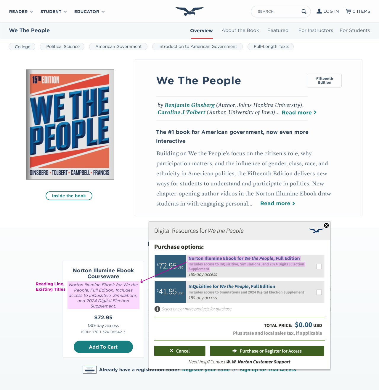
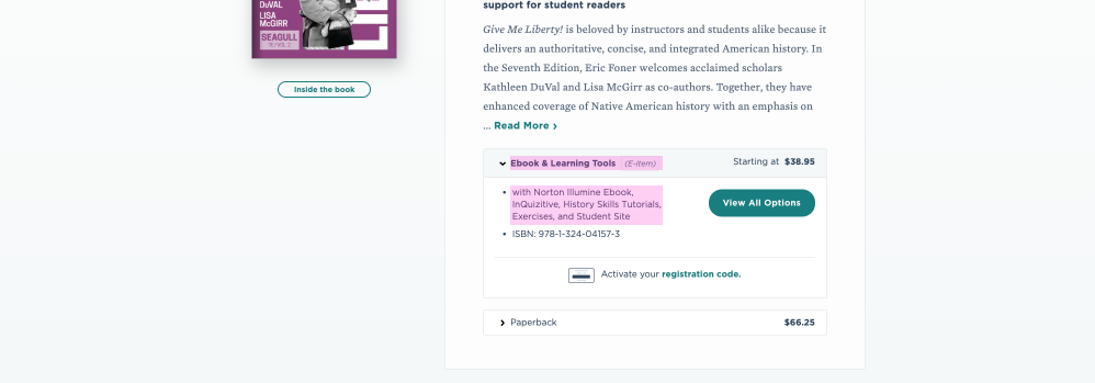
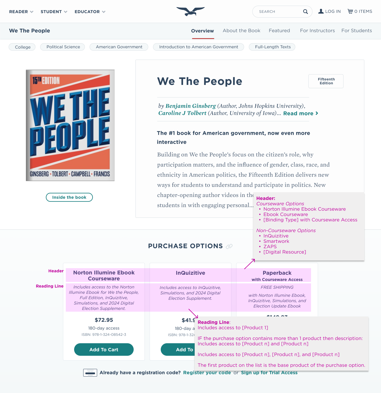
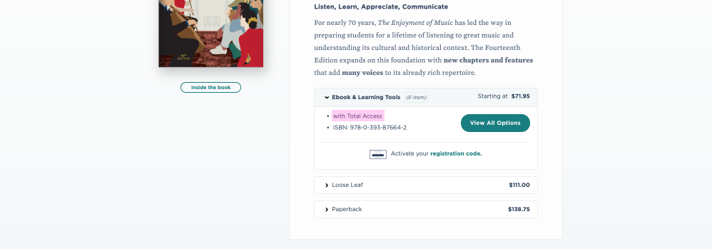
To accommodate the variety of products being sold, we created a design template alongside a content formula that scales across different product types.
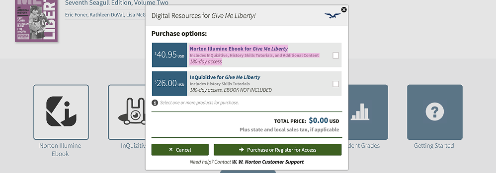

To avoid disrupting legacy products, we proposed an alternative content formula for existing titles. During the content audit, engineering raised concerns about metadata availability for the new designs. This constraint informed the content design decisions and helped shape the content formula and design template to work within what the existing infrastructure could support while still meeting the new content standards.
Design Iterations
To align the design direction with the product strategy, our team led a series of collaborative working sessions with design leadership. These sessions drove multiple rounds of iteration, allowing us to refine the purchasing experience with shared input.

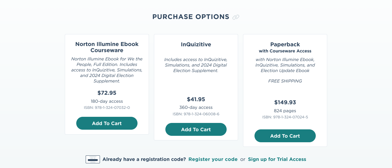
Further iterations pressure tested the purchase option display across different states and interaction scenarios within the e-commerce experience.
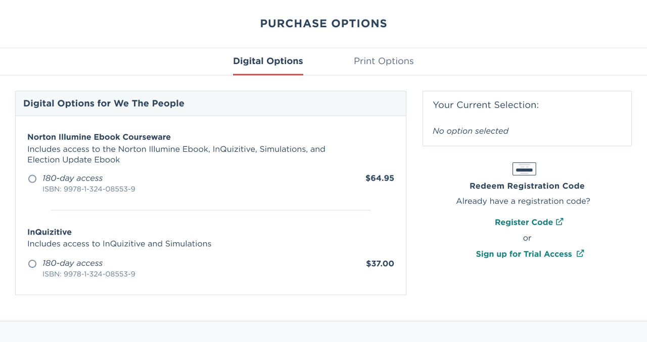
A key decision emerged during iteration. Initial designs separated digital and physical purchase options into two distinct categories, following the legacy mental model. Seeing these designs gave leadership the language to articulate what they actually wanted. Not print vs. digital, but digital with print options. This decision reflected a broader consumption pattern in college textbooks: digital access has become the primary mode, with print remaining a valued but secondary option.
Launch
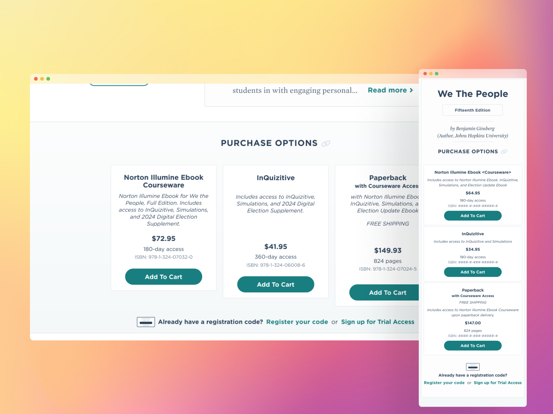
Norton's redesigned e-commerce storefront launched in Summer 2026, unifying digital and physical product purchasing into a single experience on the primary Norton website for the first time. The launch establishes the foundation for future iterations, including expanded purchase option frameworks and continued content standard improvements.
Planned Next Steps
To measure the impact of the new experience, we plan to conduct a quantitative survey gathering direct feedback from students and instructors on the redesigned purchasing flow. These findings will inform the next round of iterations and validate whether the content standards and unified purchase model are meeting user needs.
The modular purchase option design was delivered with the Good, Better, Best framework in mind, a tiered model that leadership has scoped as the next evolution of the purchasing experience. The existing design foundation is built to accommodate it without requiring a structural redesign.
